
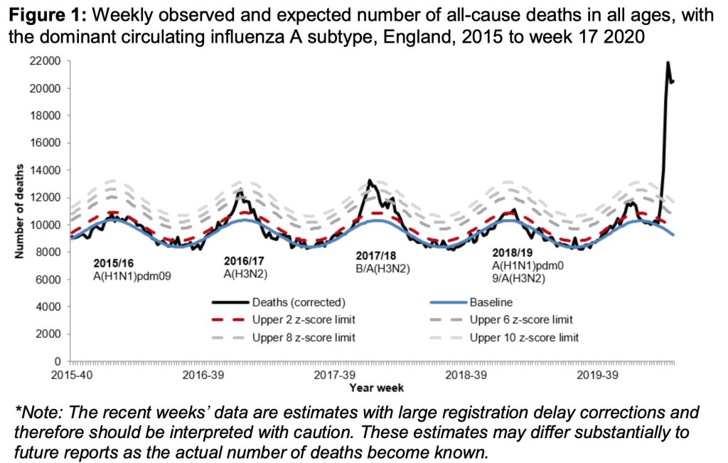
This plot, thanks again to John Burn-Murdoch, shows the total UK deaths per week over the last five years.
See the baseline deaths nicely follows the blue wave (peaks are winter when more people get sick).
Watch the ‘seasonal flu peaks’ above baseline in 2016/17 & 2017/18.
Note some years there is very little Flu (2015/2016 & 2018/2019).
Look Dick! Watch the giant Covid19 peak in 2020.
Imagine Jane!
Imagine what would have happened if there was no lockdown?
