
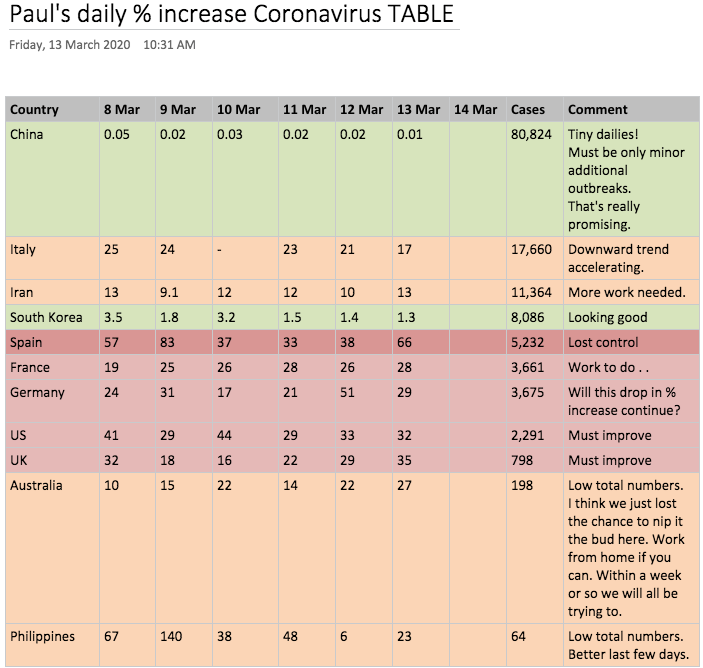
Well, here’s a Covid19 Coronavirus summary table I put together – and will update daily – because I couldn’t find it anywhere else. It tracks the recent daily % increases in cases. From my 24 months in pandemic planning – at University of Melbourne’s Global Health Department – I feel this is the key data we should be looking at to make decisions.
It’s color-coded with how the top 8 countries – and a few others of interest to my readers – are going.
It’s not looking good for this pandemic which could see millions dead this year if it is left unchecked. Don’t think ‘Oh, it’s OK, it’s stopped in China and South Korea’. It’s ONLY because of extraordinary precautions taken in those coutnries! Now we need to do it and do it sooner and better!
We should all be sensibly creating GRADUAL stockpiles of food, medicines & pet foods. Now. Because when the Italy or US-type announcement comes it’ll be pandemonium.
When (not if) there are 20-50 daily case in your city it means there are probably 100-250 infectious people WANDERING AROUND. That’s when you should voluntarily:
- Try to work from home
- Not hug relatives & friends
- Sit a few seat away in the cinema or at work
Much of the US is there already. UK & NSW is on the brink. Australia as a whole is a week away from this scenario.
The sooner we voluntarily do this the higher the chance of ensuring a small local wave of attack in our city.
Apart from social distancing, we need to hear from the biotechs and incumbents rapidly developing vaccines.
Note: Find the LATEST update to this table by clicking here (& select top post).
